Chakra Pasta Box Design
Following the conception of the Chakra Pasta logo, I was tasked with creating a pasta box design. Recognizing the word “chakra” as a spiritual term, I knew my design should invoke a supernatural affordance. I immediately thought about meditation, mandala patterns, and healthy vegetables. I began mind mapping my ideas while sketching out some layouts.
Below are two versions of how I thought I should connect these elements for the box design.
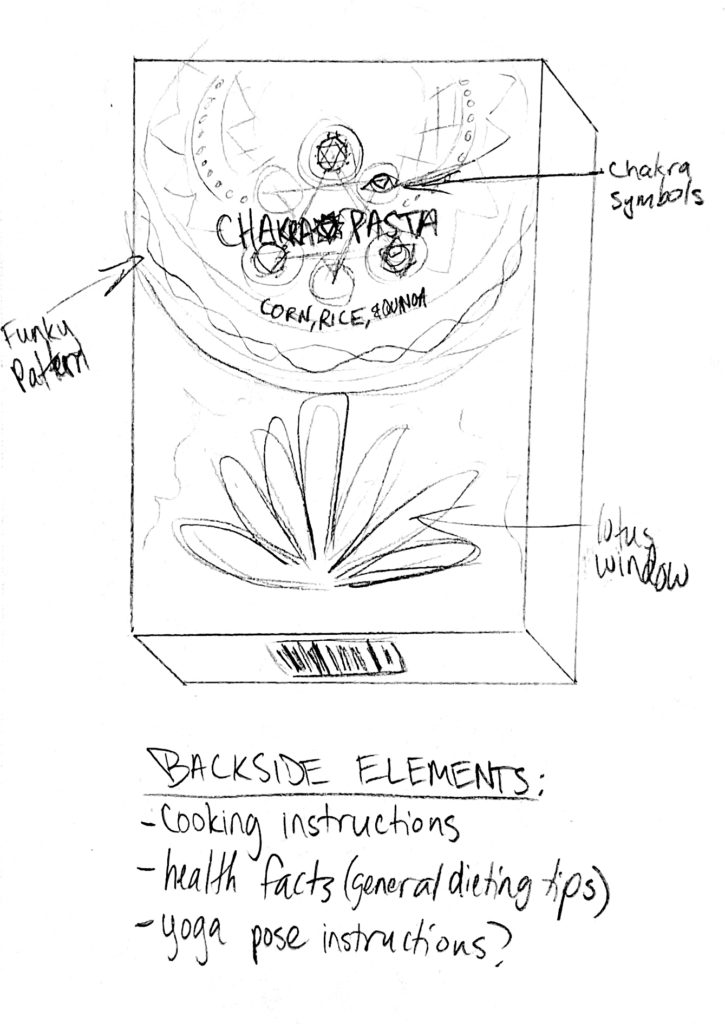
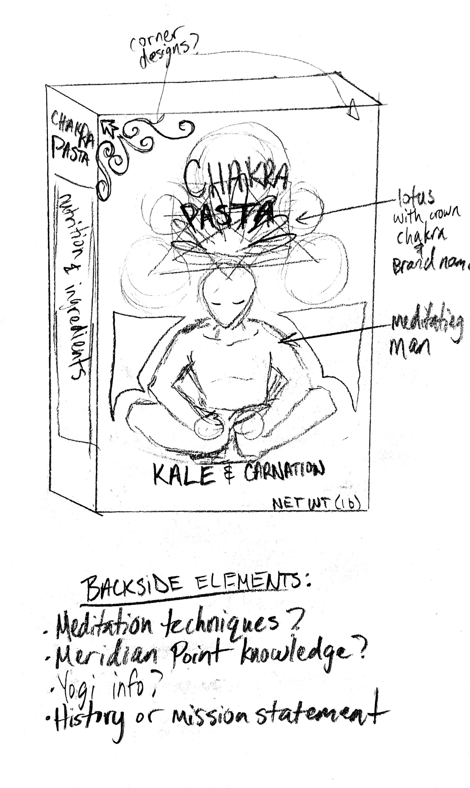
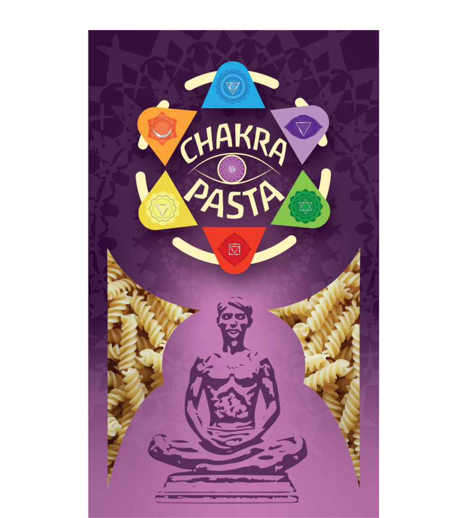
Once I made my decision, I hopped into illustrator to begin designing the front face of the box.
The node structure felt right, so I moved on to googling images of other pasta boxes that already exist in the real world. I needed to gather a list of important elements which are typically found on the package of a pasta box; things like:
- The type of pasta in the box
- Product weight
- Typical icons I might need to include
- Common ingredients found in pasta
- Cooking instructions
I placed the front face of the box design into a dieline. This helped me to start branching my design off to the other panels of the box from the face. I used InDesign to construct a nutrition label for one side panel. The other side panel was used for listing out each of the 7 chakras. The back panel was reserved for cooking instructions with a recipe idea.
The meditating man on the front of the box would also serve as an informative visual for the consumer. It illustrates the location of each chakra throughout the body. This would also tie in neatly with the placement of the logo. Since the crown chakra (Sahasrara) is believed to symbolize the higher-self (spirit), it was not shown on the meditating man’s physical body.
The logo itself symbolizes the meditating man’s crown chakra. The crown chakra is “the third eye.” It is the chakra that provides us with the power of imagination—the source of creativity. The mandala pattern illustrates the magical force of energy pulsating from the crown chakra. The logo encompasses a variety of colors, geometry, and symbolism in a single icon.
Just before finishing up, I wondered what else was missing while considering the elements which needed improvement.
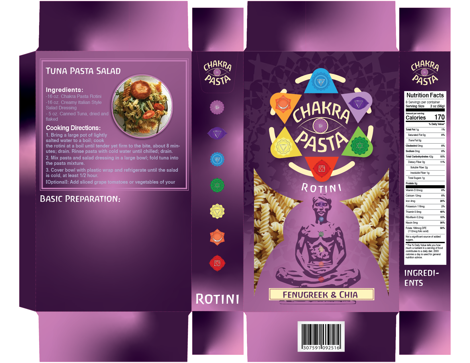
I concluded that the background gradient was way too intense, and the contrast was heavily distracting. I chose to make it closer to a dark purple than a pink. The darker patches of the gradient were changed into a subtle pink that looked nearly white. I organized the node layout to provide a better balance of space.
The final 2D box design layout

After creating the final 2D box design, I found a free pasta box mockup file online. This would provide a 3D rendition of the box, so that everyone would be able to imagine what the final product would look like after print.
The final result was the image that drove your attention to this case study.
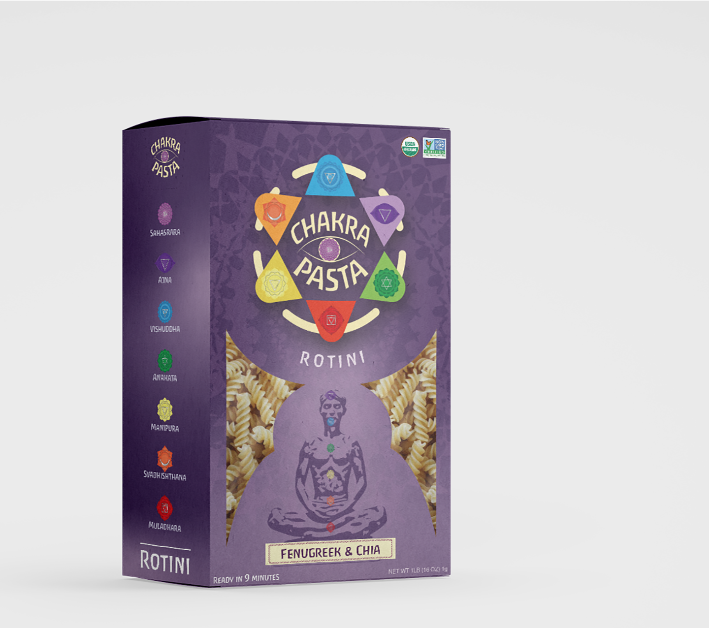
This design grew on me over the years; becoming one of my favorites. It brings me joy to know that I can use my abilities to speak to an audience that I truly resonate with. I am also pleased to announce that the wonderful folks at DesignRush also appreciate this piece. In fact, DesignRush has chosen to feature this design in their 2024 list of The Best Retail Packaging Designs! You can click this link here to read the article.
DesignRush is an excellent source for discovering great work from information technology and graphic design service providers. DesignRush not only showcases great work, but they can even help in connecting you to top-tier service providers in these fields! When you finish reading the article, I recommend you browse through some of the outstanding projects DesignRush has discovered in their findings. DesignRush, if you see this, I want you to know we’re all grateful for the information you share!
