Chakra Pasta Logo Design
Imagine creating your own pasta brand from scratch. If you want to make big money you need to solve big problems, right? So where does pasta fit in that equation?
The only obvious problem we can solve is hunger, but there are so many other options when it comes to fighting hunger—rendering pasta to be quite the commodity. I mean who can really tell the difference between pasta brands without seeing the boxes they came from? Can you even name a pasta brand off the top of your head right now without cheating? You’re probably wondering: “What the s&*t is this guy even talking about??”
I’m talking about perceived value. Brand appeal. The importance of a target audience paired with a strong value proposition.
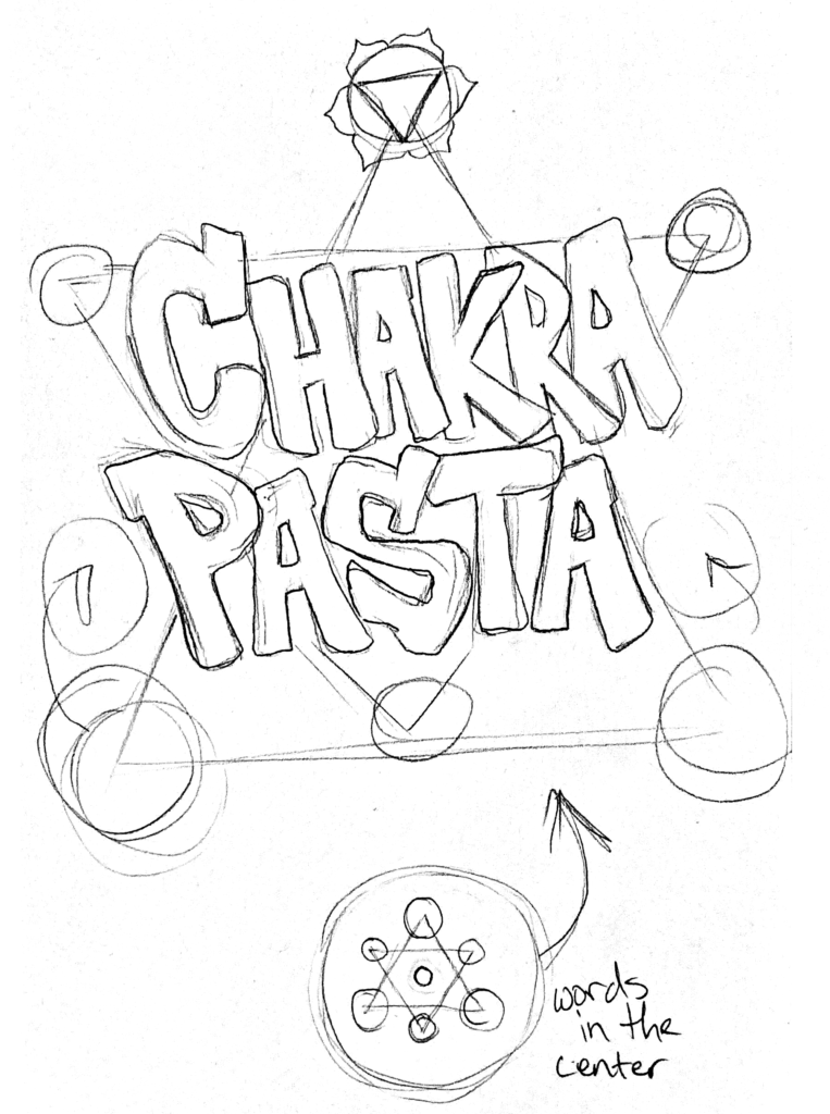
With that out of the way, you might now be able to better understand why I chose to use this messy little sketch to come up with my own pasta brand.

Not only has modern research revealed that brands earn larger profit margins when they speak directly to a target audience, but we’ve also discovered that humans are far more likely to remember things that are unusual and fun/engaging.
As I began creating a new pasta brand, I knew the first step was to figure out who I was speaking to. If I try to design a logo without first knowing my target audience, then I would have no sense of direction while sketching ideas. I decided I would target individuals who are rich in spiritual health and practice.
I cared not for their age because everyone eats pasta. I wanted to offer them a product that was produced with healthier ingredients. My value proposition was to enable and foster a connection between spiritual practitioners. I wanted my brand to resonate with their personal values and allow them to feel seen and heard.
Spiritual folks are often familiar with terms such as “meditation” and “chakras.” When I started sketching my logo, I was listing out different spiritual terms like those. I was trying to connect the dots between spirituality and pasta. Ultimately, I just felt like “Chakra Pasta” was the name that would work best for my brand.
After my sketch, I brought the image into Adobe Illustrator and tried to play around with the elements. I strategically chose to work with a hexagram shape. This would help me combine each charka into a single unified element.

As I continued to toss the idea around in my head, I wondered how I would color everything. Each chakra is historically represented with its’ own color. I reordered the colors so that their compliments were on the opposite points of the logo. Where each color was placed was chosen purely out of instinct.
Once I finished arranging the colors I cleaned up the overall shape by rounding the outer vertices. I placed chakras in each triangle around the central hexagon. The hexagon at the center was used to house the Sahasrara chakra (or crown chakra) because of its’ unique role.

Once I placed each chakra symbol into my logo and rounded off the edges, I traced in the words from my original sketch. The style was just a little too overwhelming, so I sought out a font that looked similar to that style.
The Sahasrara chakra was framed within the outline of an eye because it is know as the third eye.
I would then go on to use this logo to generate my Chakra Pasta box design.
