Designing a Wayfinding Kiosk
As a newcomer to New England Tech, one might be lost without the help of a guide. Even after being shown around by a tour guide, one could find themselves getting lost on their first day of classes. This would happen due to the fact that our wayfinding system could currently use some help — which sheds some light on the current limitations the school’s design.
A great school environment would surely attract students who are serious about their education. This would, in turn, benefit the school’s reputation, desirability and its shareholders. The graphic design students have been called upon to produce ideas on how we would remedy this situation. As a student in the graphic design department, I was tasked to produce a version of this wayfinding kiosk design.
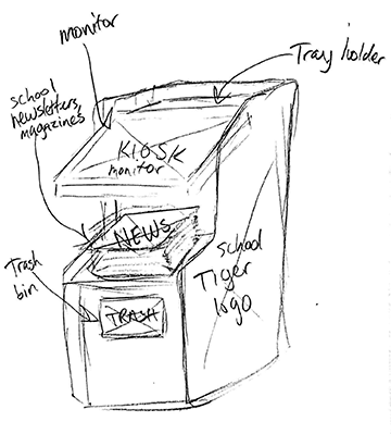
As usual, I started out with some quick sketches. I didn’t end up saving any of the other designs I scribbled out (because they were done on sticky notes), but I kept the one rough sketch that I would work off of.
This rough draft sketch would serve to be the basis of my wayfinding kiosk design
As I began designing the visual interface, I listed out the key elements that I would need to incorporate in my design. I figured that a wayfinding interface should be as simple and clean as possible. If it’s not then the viewer would probably be more confused than they were before. So the elements of the design would be few. I’d simply need:
- A heading with the current floor level
- A visual map of the floor
- Iconography to identify key locations (such as stairwells, restrooms, elevators, etc.)
- A legend to help the viewer identify each icon
I produced the following draft for my kiosk interface design
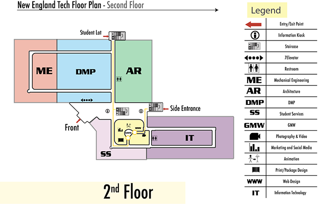
The interface would work, but there had to be some adjustments. The color scheme was pretty aimless and boring. Some icons were way too small on the map, and there was no real separation of elements. I would further organize the node structure to produce an enhanced affordance.
I chose blue and white for the base colors of the interface because it looked futuristic and clean. Thinking back in hindsight, I would reduce the intensity of the blues that I used.
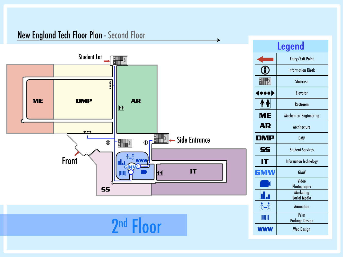
The updated interface design would serve as the face for my wayfinding kiosk
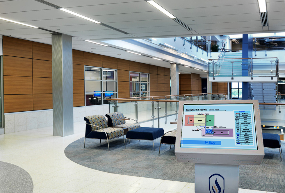
After getting a cleaner interface design, I would find a kiosk mockup on the web. This would help others to understand where the design fits and how it would be displayed in the school. Since CO-VID 19 was an issue, the school was off limits for the time being. I could not get my own picture for the kiosk, so I also found a picture online to fit the mockup. Luckily, there was a photo on google images that showed a partial area of where I thought a kiosk should stand. The area received a decent amount of foot traffic, so I thought it would be helpful to place it where I did.
The kiosk would be photoshopped as a mockup to fit a heavy-traffic location