The Met Mobile Mockup
When it comes to designing a new website, every little detail matters. Aside from the speed at which your page loads up, it’s important that the visitor is immediately enticed once it’s done loading. The content that your visitor sees before they scroll or click on anything is what we refer to as content which sits “above the fold.” If this content doesn’t immediately compel the visitor to explore your website, then you could potentially lose that visitor’s attention and boost your bounce rates.
We want our visitor to see a clear-cut navigation menu with simple, normal terms which accurately describe where the links will lead them. We need to provide the visitor with some sort of confirmation that they made it to the site that they intended to visit. Including your logo and/or business name above the fold is a great way to implicitly deliver that confirmation. If you’re a business, you’d be wise to take it a step further by including your phone number and physical address above the fold. It’s often also good practice to make all of those elements static so that the visitor is never lost and always staring right at your contact information in case they need to use it. Each node should be organized in descending order of importance from the top down.
To help visualize the hierarchy of information, we can use a “sticky pyramid”. You might also hear this technique referred to as “mind mapping.”
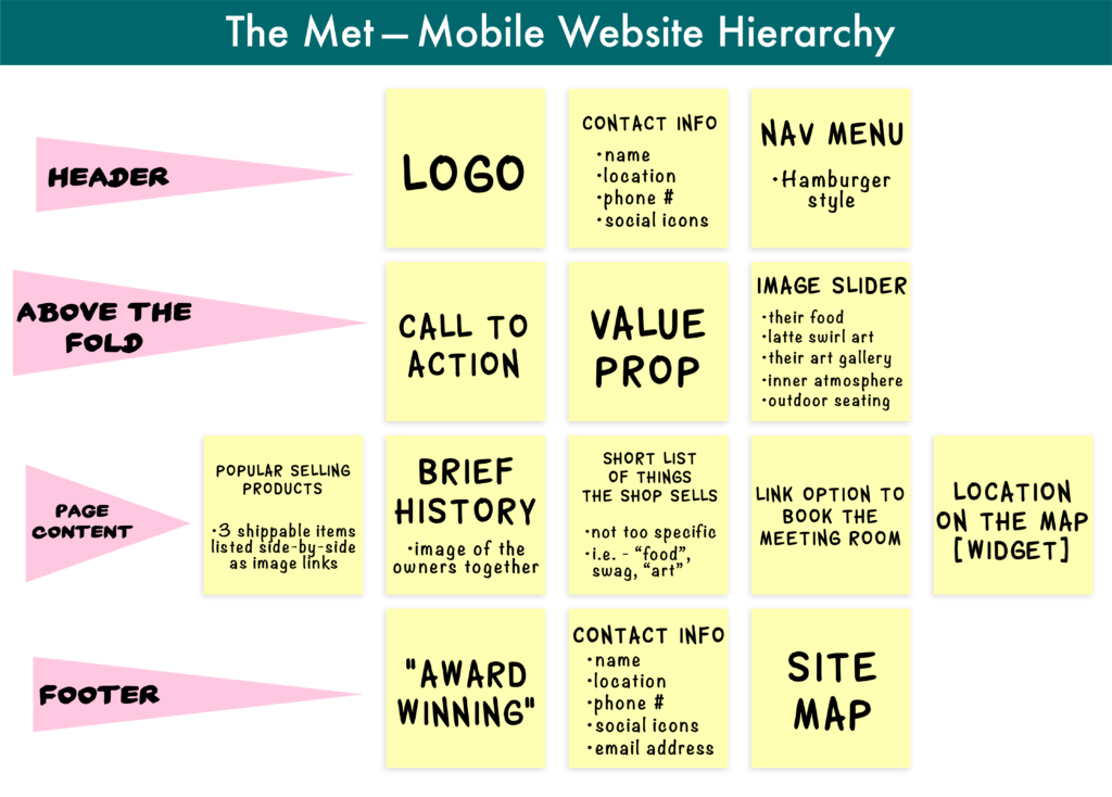
After creating a new brand identity for The Metropolitan Coffeehouse my assignment was to utilize the aforementioned principles to generate a compelling mockup. This mockup would be used to illustrate the effectiveness of The Met’s new brand identity through a mobile web interface. It only needed to display the content above the fold in portrait orientation.
After I made my sticky pyramid to identify all of the elements I should include in order of importance, I created what is known as a “journey board.” This journey board would be used to help me explain the visitor’s journey through the website for The Met’s understanding. A journey board can be a handy device to help with this explanation because it tends to say more with less words.
I started with a rough sketch of my journey board before later polishing it up in illustrator. I chose to use the Saco River to illustrate the flow of the user experience once a visitor found their way to The Met’s rebranded website.
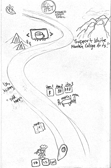
As you can see from the sketch, each major point of interest would be plotted along the visitor’s journey as they travel down the river in their boat. I wanted the logo, contact information, value proposition and some captivating images within a slider sitting above the fold. As the visitor traveled further down the river, they would pass by less important nodes.
Once this blueprint was laid out, I scanned it into illustrator and traced everything out to make it more clear to the audience what was going on with the journey map.
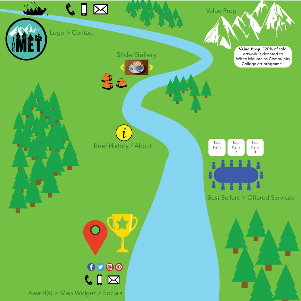
After some review of the journey board, I discovered that this layout was a bit confusing because it was hard for some folks to understand where the journey started. The reason folks were confused is because of the scale of each image. Some thought we should start at the larger elements and work our way out towards the smaller elements. In my mind I expected people to read the image from the top left as if they were reading text.
I needed to revise this journey board by scaling each element to make the starting point a little more obvious. To do this, I made the logo larger, brought the boat a bit closer in with the action, and thinned the river width a bit on the bottom half of the page. As you can see, I also added some buildings and moved the little red location marker over next to the buildings to imply that the end goal was to make it into the city.
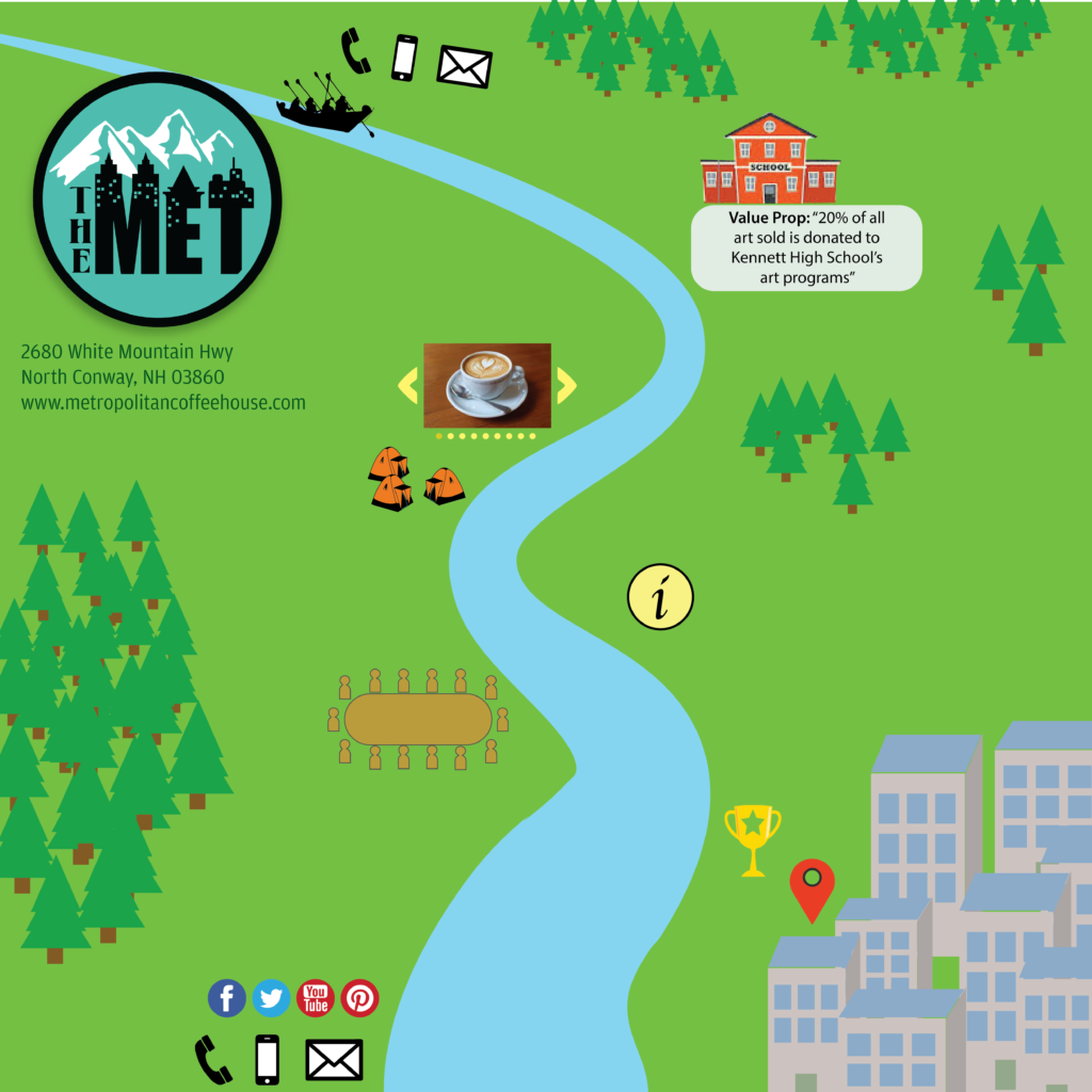
Once this journey board was done, I used it to remind myself how I would lay out each node within the mockup. I simply just made another artboard right next to my journey board in illustrator and started to design the layout of the page with large shapes. Once I had the layout in place, I started experimenting with the placement of each node. I thoroughly thought through each element and which html tags they would be wrapped in. Again, every detail matters because search engines like Google will rank your page based on the tags which your page elements are wrapped in.
For example: an ‘H1 tag’ (the largest heading tag) tells a search engine that the text contained therewithin is much more important than text you would find inside of a ‘p tag’ (short for paragraph tag). As I placed each element into the mockup, I marked off each block of text with the tags they would be wrapped in to highlight the page heirarchy being defined for search engines. This helps with SEO (Search Engine Optimization) so that our website can be found before market competitors.
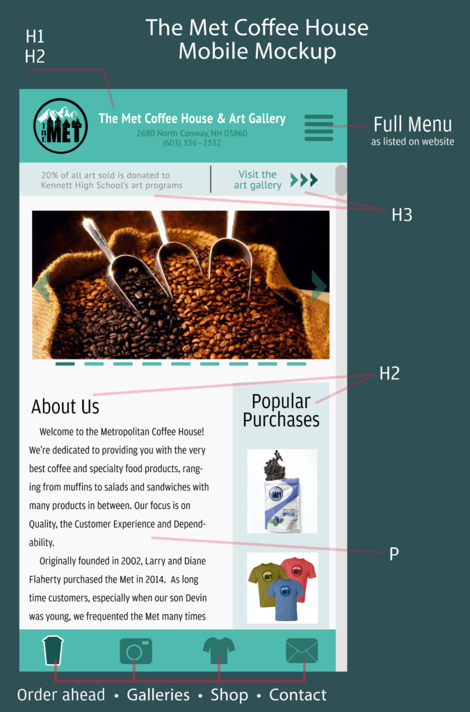
After I had this 2D mockup laid out, I queried the web for some free mobile device mockup templates. I couldn’t find any nice first person mockups, so I ended up using an image I found of a person looking at their phone in first person view and brought it into photoshop to turn it into a mockup.
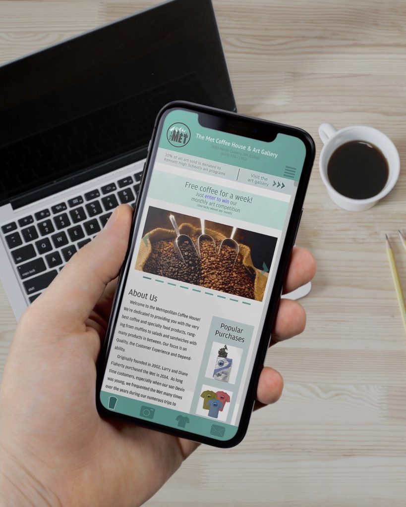
This project helped me understand the utility that mind mapping and journey boards bring to the table when designing a website. These methods help us exponentially speed up our work flow in the field of web design. It’s very much like how painters block out large shapes before adding in the details. Once you identify the key elements and map out where each should be placed, you’ve done most of the hard work. You can then quickly build your page from the schema you’ve developed and fine tune the details once everything is in its’ place.
