Redesigning The Met Logo
When developing an effective brand identity it’s often a wise choice to start with the logo. The logo is more important than one might think. It’s the crux of brand’s existence if that brand requires any sort of marketing.
When I say “McDonalds” you likely conjure up an image of those infamous golden arches in your mind’s eye; rather than your friend Larry McDonald or that old McDonald had a farm tune. That’s because the McDonalds brand used this iconic logo for decades, and it’s now so much a part of all our lives that it’s the first thing we think of when we hear that word.
That being said, if we want to design a world-class brand name then we need to be willing to invest a fair amount of time and thought into our brand’s visual identity. We need to deploy a brand strategy based on preliminary research (otherwise known as “due diligence”).
The image below illustrates how this is typically achieved using a SWOT analysis technique. This mechanism highlights 4 primary concerns in the process of branding a business. As you can see, SWOT is an acronym for Strengths, Weaknesses, Opportunities, and Threats.
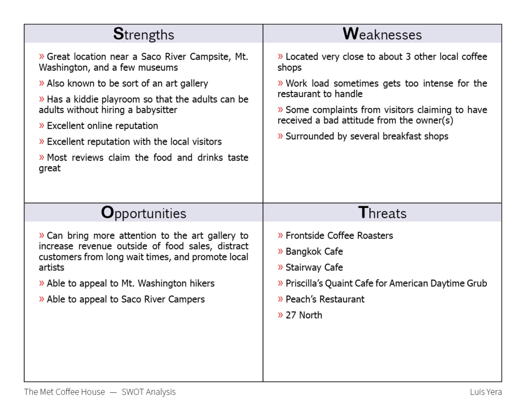
Before we start designing for a brand we should fill out a SWOT analysis to highlight important information regarding the business. We want to know:
- What makes this company stand out from the competition or what they are exceptionally good at doing (Strengths).
- What does this company have trouble doing? For example: Is the company too commoditized or offering too many products/services than they should (Weaknesses)?
- What are some interesting local attractions or traditions that could help to market the product/service? If you’re selling products near The Statue of Liberty wouldn’t it be wise to sell items pertaining to The Statue of Liberty (Opportunities)?
- Are there any other competitors nearby who offer the same or very similar products/services and could potentially steal business from you? (Threats)?
Once we’ve taken this information into account, we have some useful criteria to start thinking about font styles, color schemes, and even a target audience/avatar. In my case, I was redesigning a brand known as The Metropolitan Coffeehouse in North Conway, New Hampshire. With my SWOT analysis I discovered that The Met actually has an art gallery of sorts within its’ dining area. I also discovered that The Met is stationed near a Saco River campsite, Mount Washington, and several other coffee and breakfast shops. There are also a few schools nearby.
I leveraged Google images and Google maps to get a feel for the atmosphere and local community since I’ve never been there myself. This analysis set the stage for ideas to start flowing. As usual, I began with a few sketches:
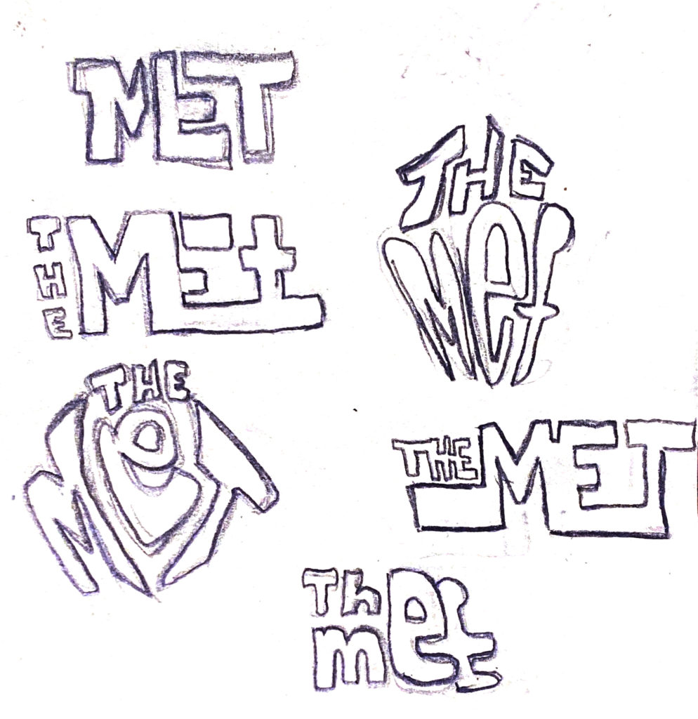
Once I selected a candidate, I traced it in illustrator and began to play with different colors and type faces. I was having more trouble than I thought I would while creating this new logo because it has such a challenging name to work with. I was having a lot of trouble figuring out where to place the word “The” in the logo.
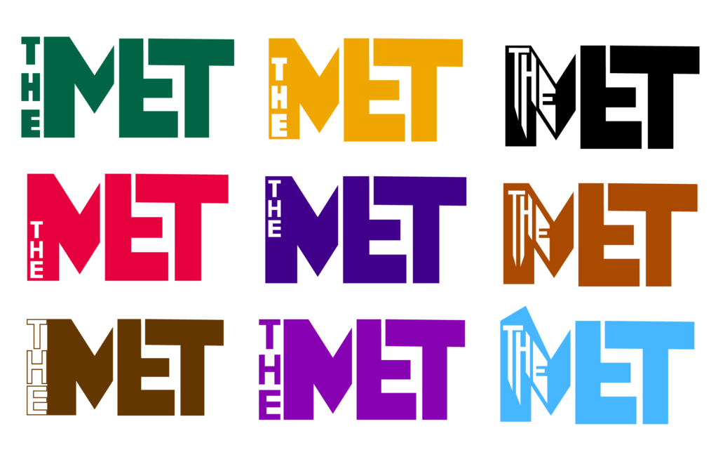
After taking a break, I came back to the design hoping I would be able to see it from a different angle. I needed to take a step back, and look at the bigger picture if I wanted to think outside of the box.
When I came back to my design I started within a new document. This way I wouldn’t be influenced by the same look and feel that I couldn’t help but to keep repeating. That didn’t turn out so well, because I still hadn’t broken the frame.
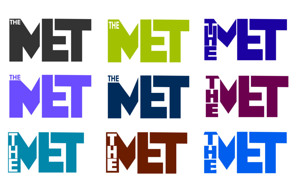
Honestly, I was tired of the squarish, straight edges. I started fresh with nothing but a circle on the canvas. I dug through the Internet for some new fonts to play with. The Met also offers a meeting room for rent so I thought maybe I should try to incorporate a fellow in a suit reaching out for a handshake. I then realized that it wasn’t the main selling point and it wasn’t a very useful idea.
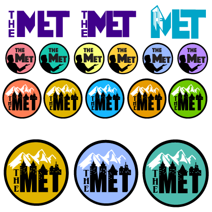
I found a cityscape font which worked well because The Met is located in an area with a lot of business and structures. I added mountains behind that cityscape font to imply a mountain range nearby. Even though Mount Washington doesn’t accumulate ice caps, I figured it would clearly communicate that The Met is closely linked to a mountain range. One image on Google showed the outside of the building and they had these green awnings on their windows. I sampled that green color and used it for the logo.
Once I switched to a round frame, cityscape typeface, and that mountain range I felt like I was ready to move on to the next step. I created a few mockups using my new logo to see how it would look on different items that might be offered at The Met.
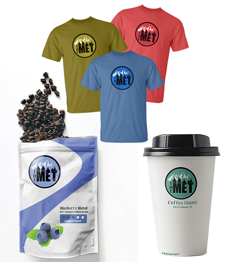
It was a tough name to work with, but I think it came out pretty nice in the end. This new logo was simple, scalable, and relevant. We could effectively print it on coasters, bottle caps, stickers, T-Shirts and K-Cups. In fact, that’s exactly what the next step in this process was. I would go on to implement this new logo in a K-Cup box design.
